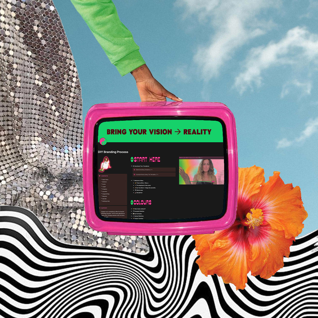

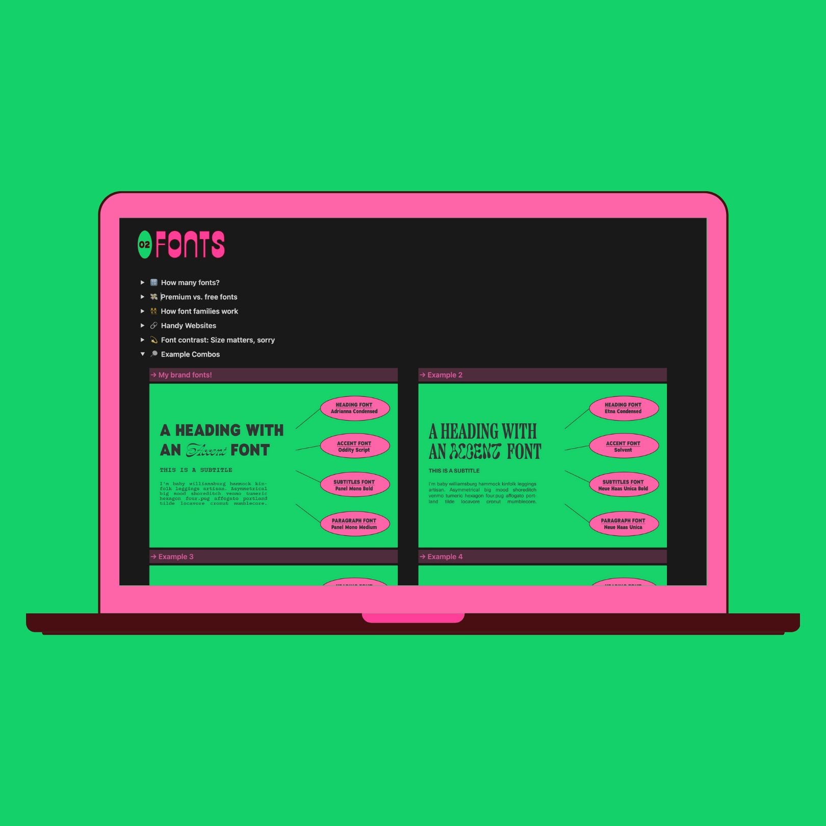
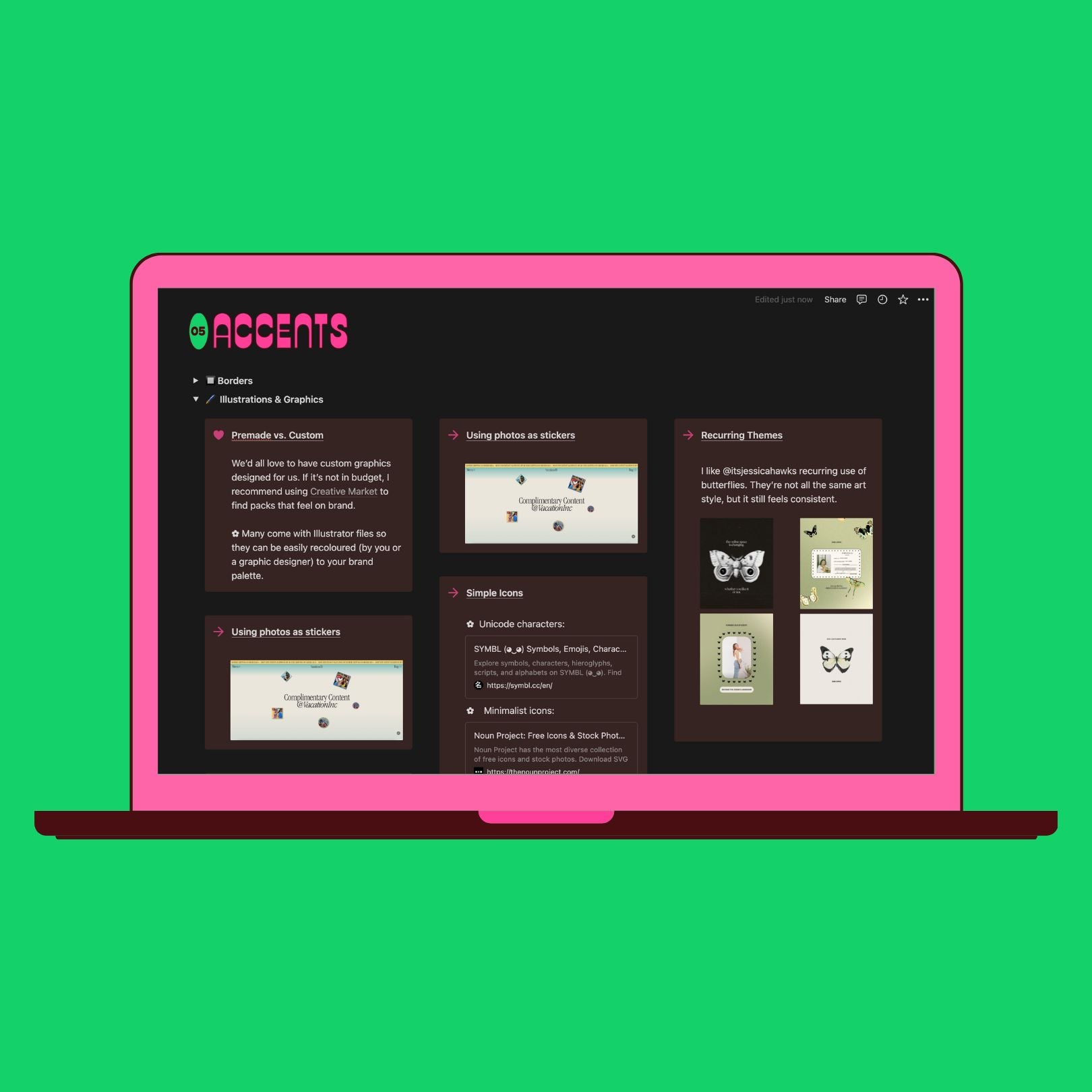
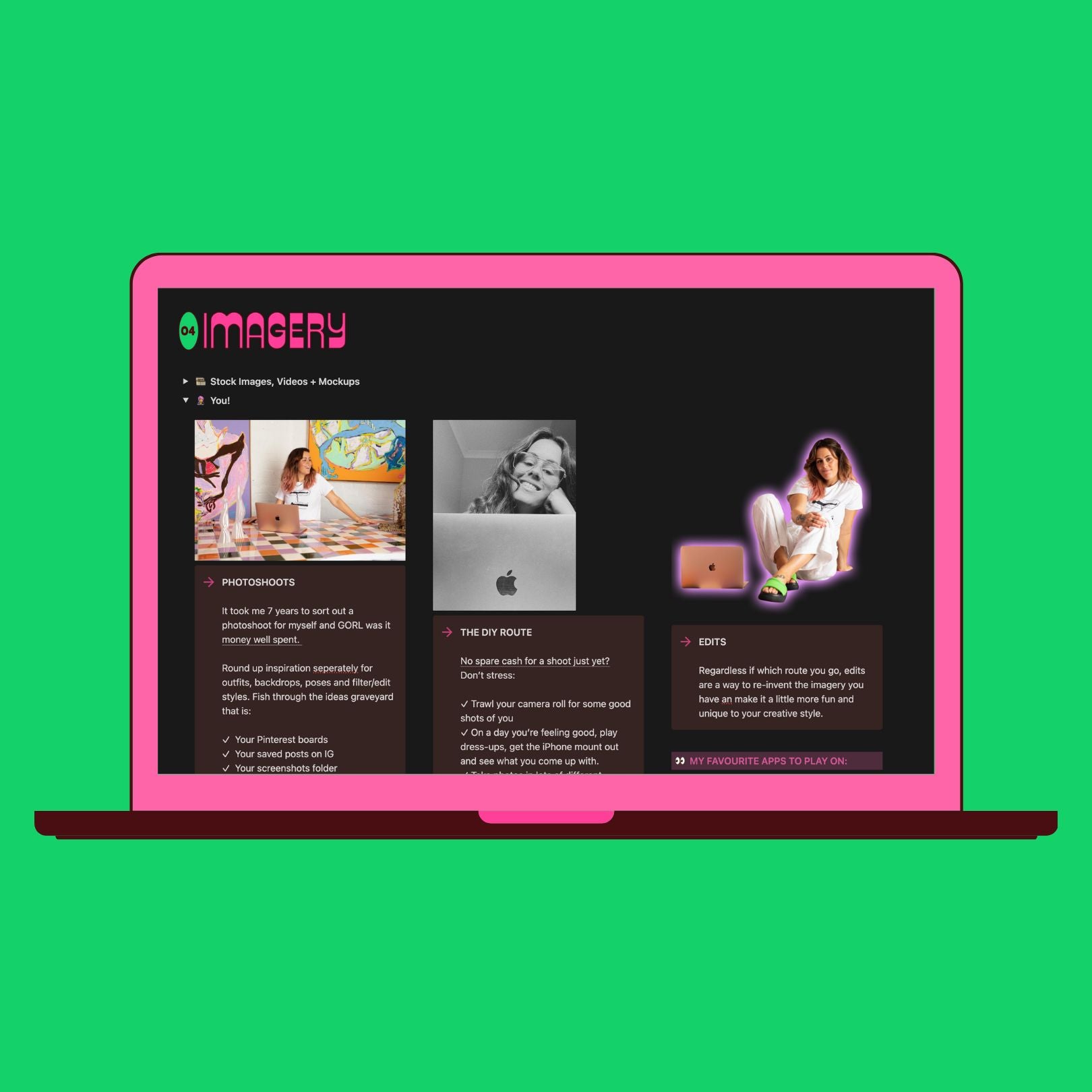
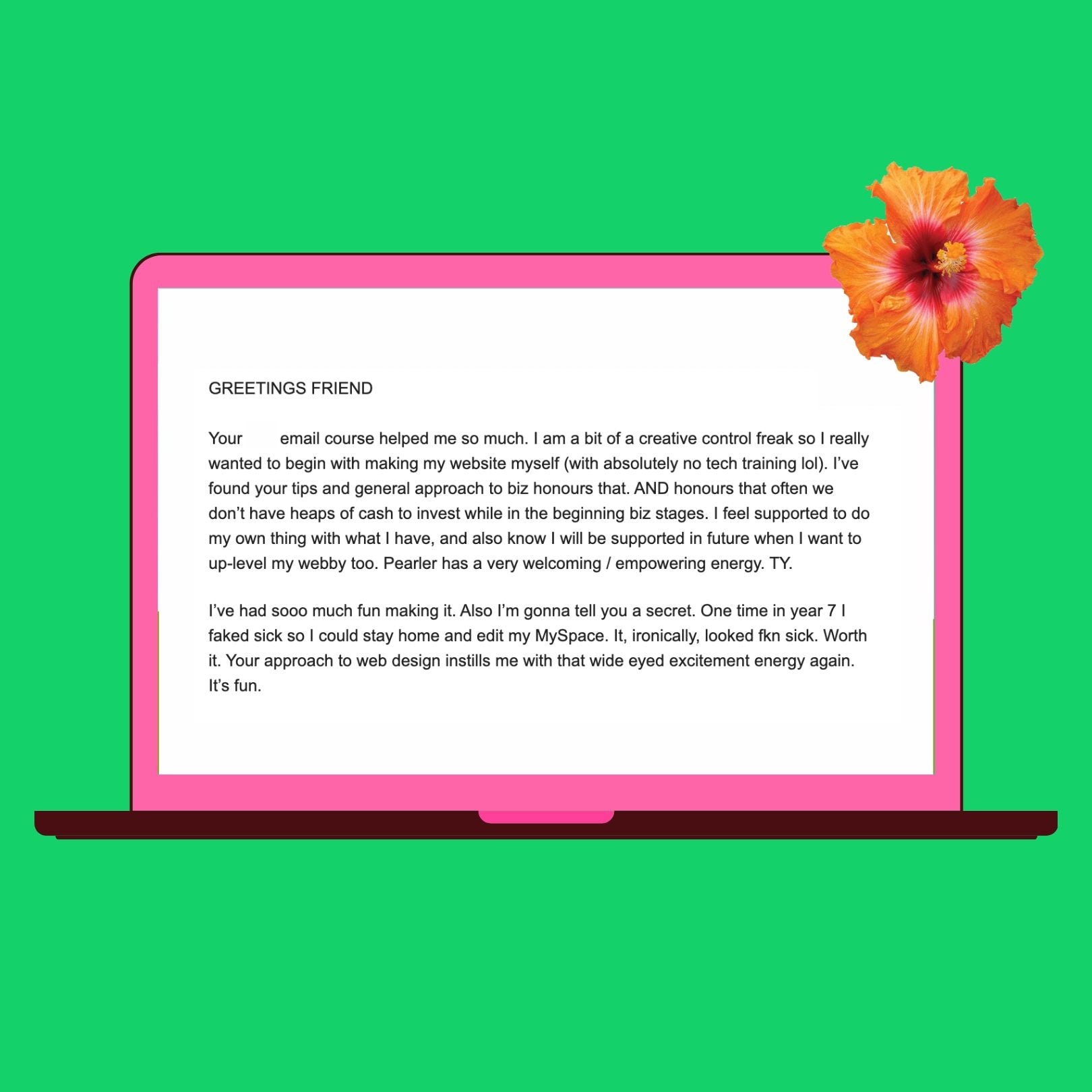
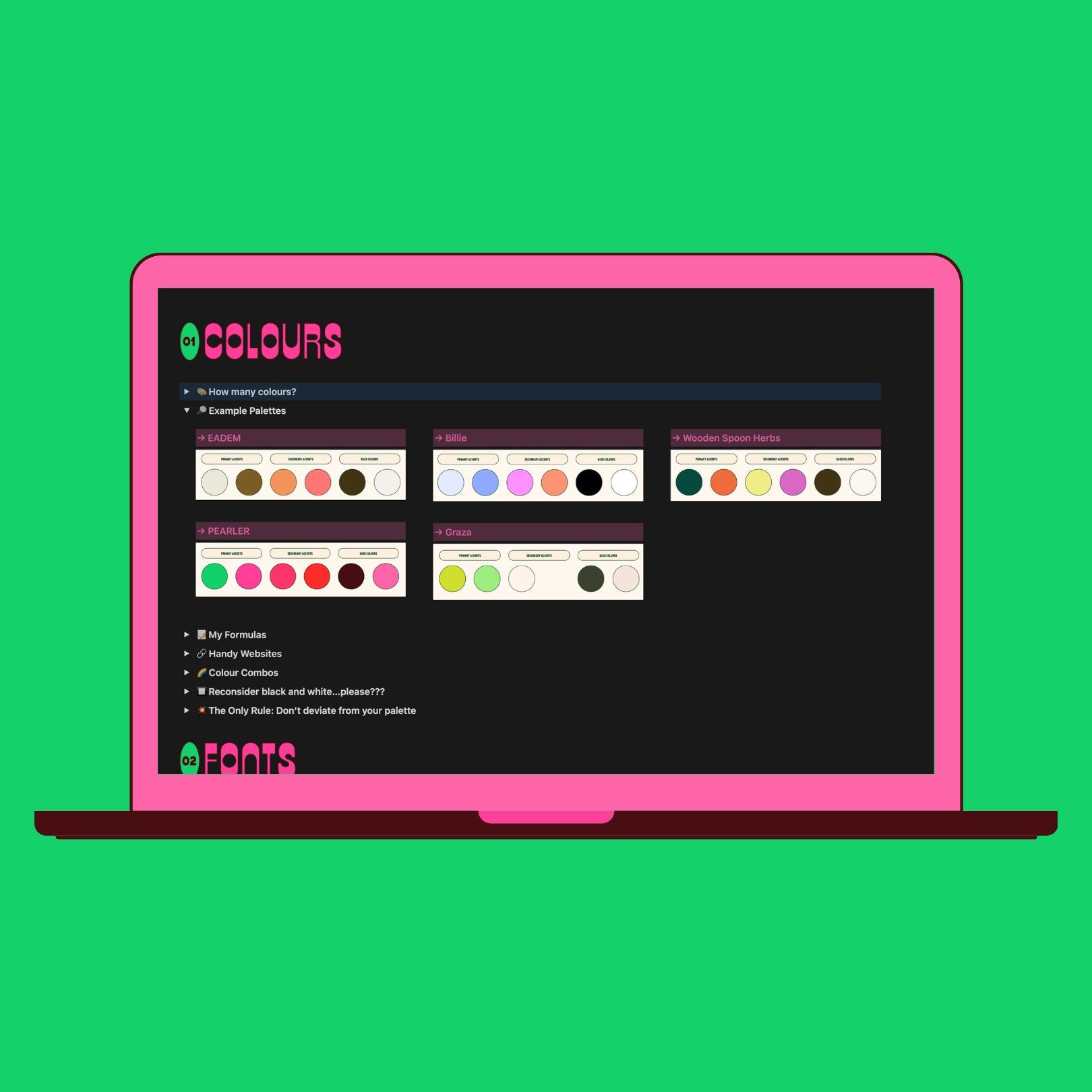


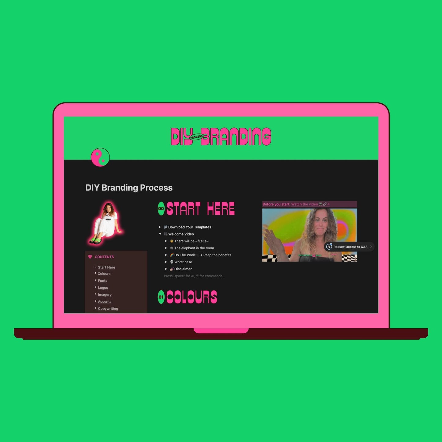


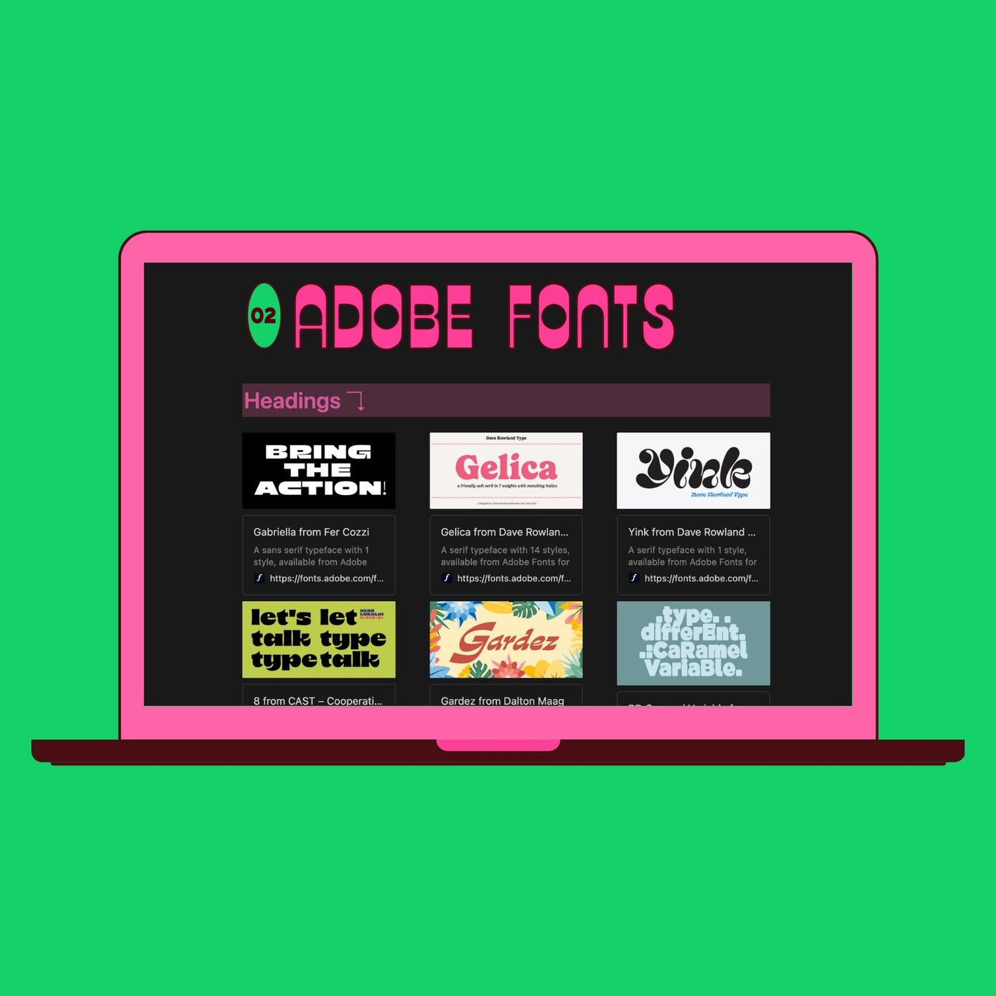
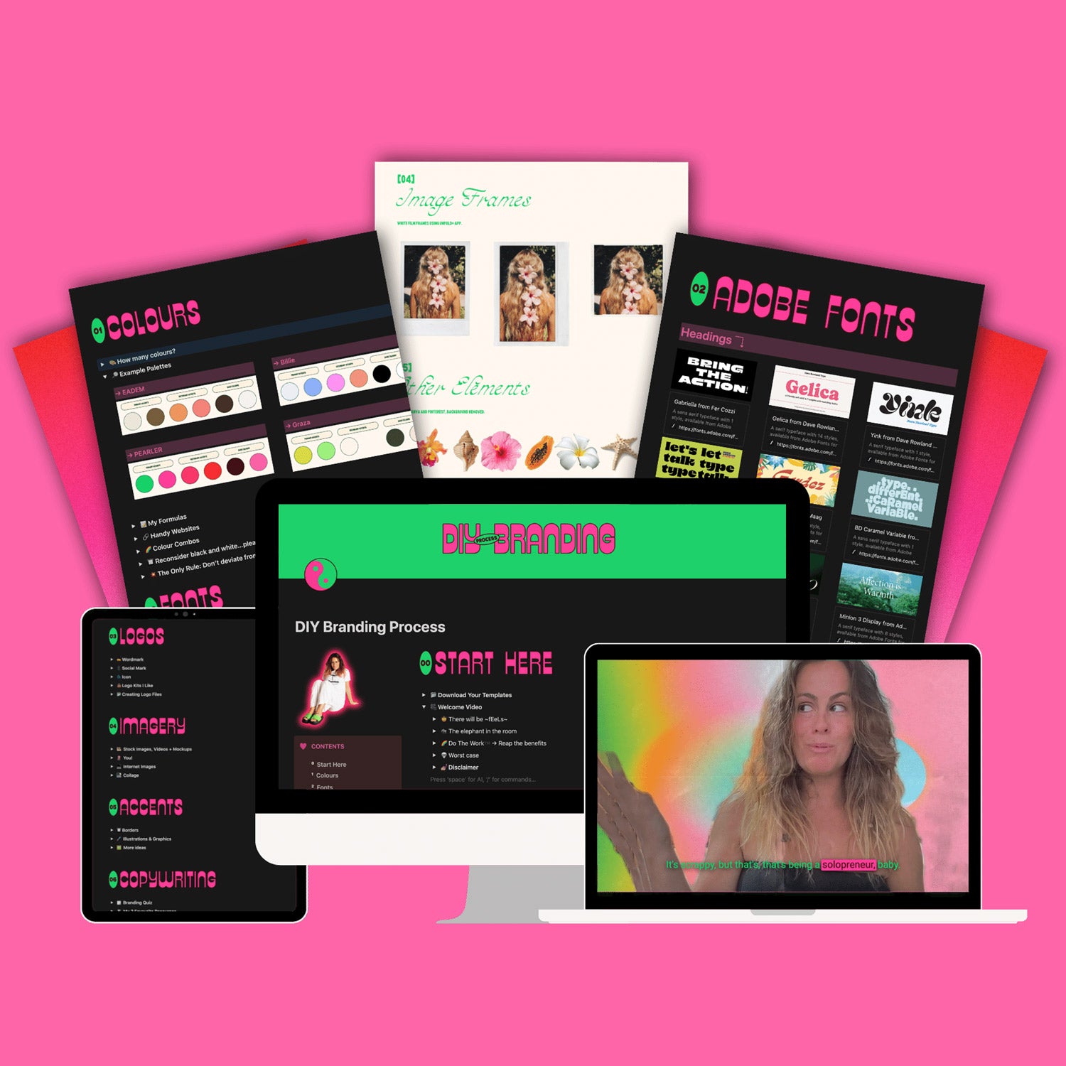
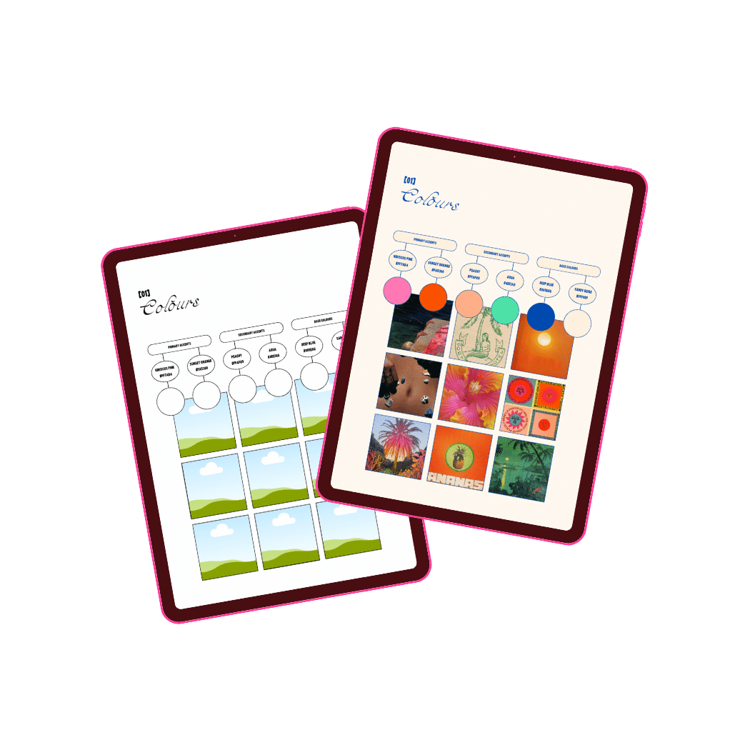
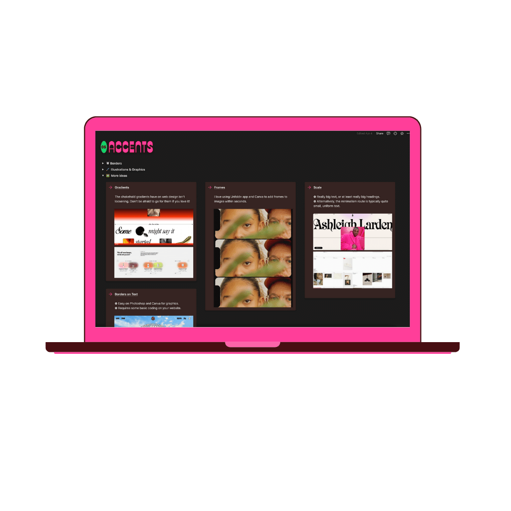
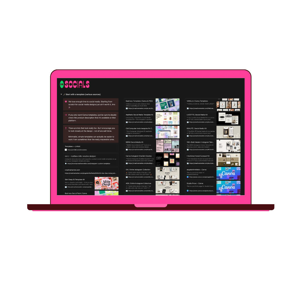

Step 0: Your Branding
DIY websites become 'failed projects' usually cos you didn't build up your brand assets prior. The fix? It's fun af.
I've made a Notion file absolutely choccers with tools to build or refresh each of your branding elements.
See it here →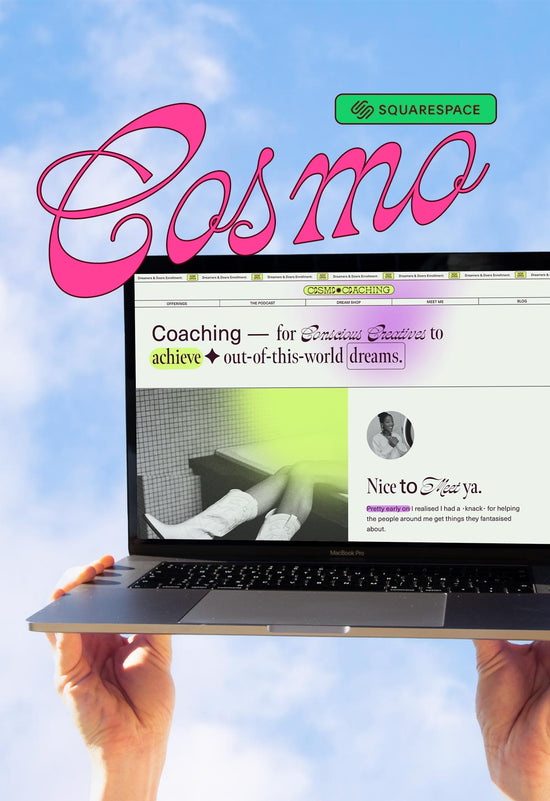
Step 1: Squarespace Template
I'm OG template designer, I cannot tell you how elite and considered they have evolved to become! <333
COSMO is a chameleonic, over-achieving Queen to designed to scale. Find me a cuter, more attention-seeking template with as many pages and modern features as this baby???
Demo & Info →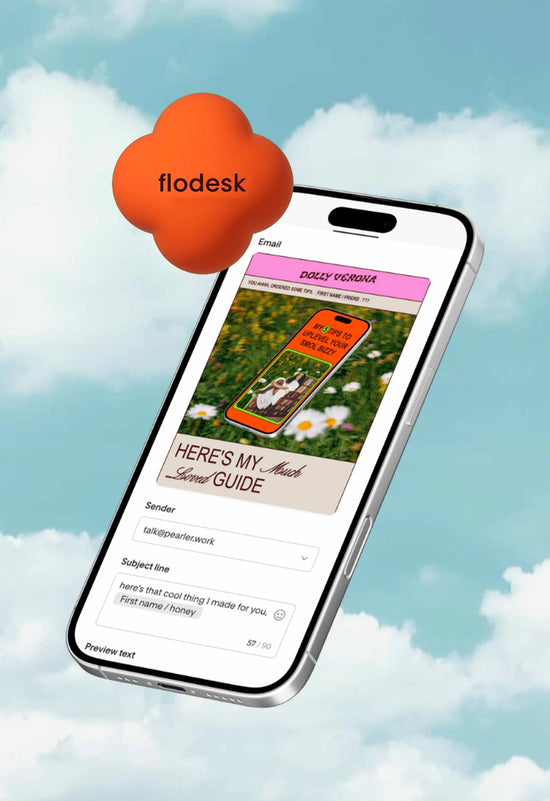
Step 2: Flodesk Email
You've made your website, it's time to be seen and deeply connect with Your People ™️.
As an early adopter of Flodesk, it's truly been a game-changer for my solo-biz clients.
So, I've created super fun, unique and non-coercive email templates and automations to make it super easy for you to show up in people's inboxes.
Flodesk Templates →
Step 3: Book Me For A Day
I'll mine your magic and amplify your design. Fast. Once your website is live, making you bank, I can add that extra 'wow' factor to your site or branding, smooth out any janky DIY bits, whatever.
Perfect for hyper-creative or neurodivergent people who have big visions other less intuitive designers can't seem to grasp.
These slots come and go — take advantage while they're there.
Let me work magic →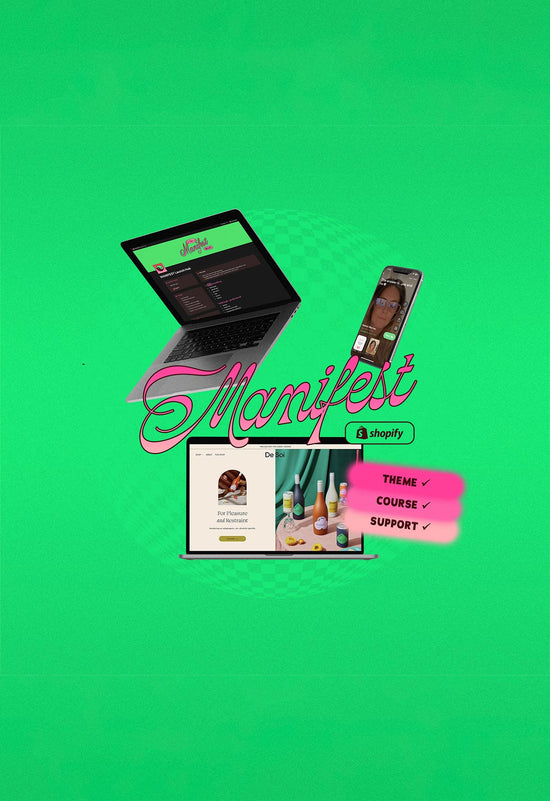
Step 4: On Shopify?
No more FOMO. I created the antidote to fugly, template-y Shopify themes that ~has it all~. She's born from 10 years of my Shopify frustrations.
Whether you're already there or your Squarespace has outgrown their eCom functions, MANIFEST is your girl.
Watch the tour, blow your mind:

Step 5: Custom Websites
The 'full Katie' experience. You are my special interest for a week or two. I'm a conduit to your wildest, most layered visions - finally bringing them to life. Brand, web, socials, whatever.
We don't skip the strategy, though. There's business consultancy baked in - we'll figure out your tech stack, timeline, priorities and I'll arm you with homework for when it's all over.
Let's talk about it →